This project documents the logo design process for a local community cornerstone: The Ledge.
Located in the heart of the Spring Creek community in Jackson, Tennessee, The Ledge is a non-profit gathering hall for faith, family, and flourishing. The goal was to capture that spirit of “elevation” and translate it into a symbol that feels timeless.
1. Surveying the Site: Understanding the Role
Every effective logo design process begins with listening. Before a pencil was touched, time was spent with the staff to understand their “Four E’s”: Education, Enrichment, Entertainment, and Events.
The design needed to bridge the gap between rural history and future growth, anchored in five core values: Faith, Family, Community, Preservation, and Growth. Not just a checklist; the mortar that held every creative decision together.
2. The First Cut: Sketching & Symbol Exploration
There’s a friction to lead on paper that’s worth trusting. This stage is intentionally raw: sketching lets ideas breathe before the rigid lines of software take over. Abstract shapes and literal emblems both got explored.
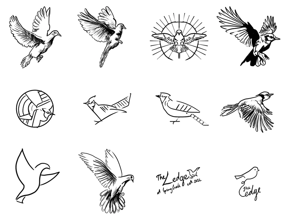
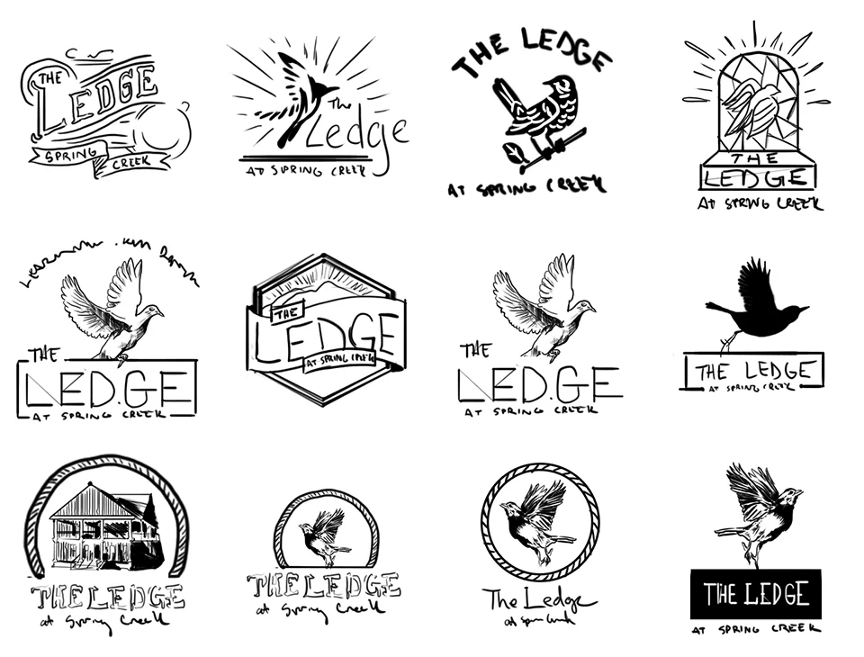
Many ideas were left on the cutting room floor, searching for a symbol that could represent an individual’s leap of faith and the collective strength of a community.
3. Selecting the Grain: Typography Direction
A logo’s “voice” is found in its type. For The Ledge, the letters needed to be sturdy enough to be read from a passing truck on Highway 70, yet warm enough to welcome a neighbor.
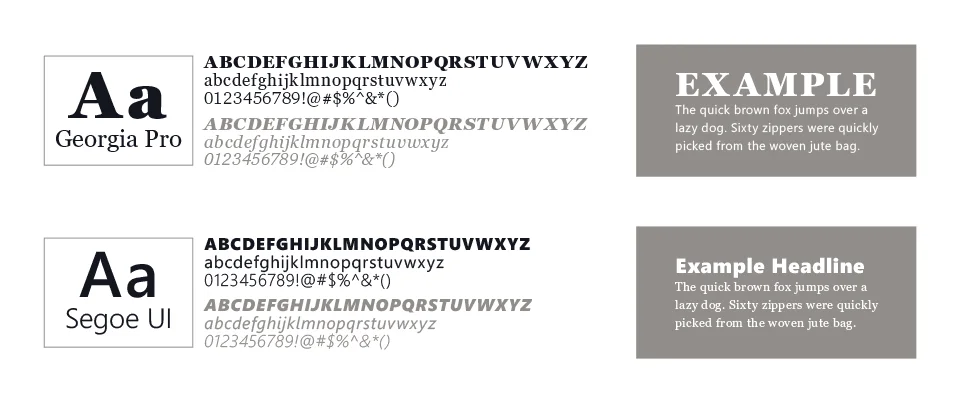
Georgia Pro is a transitional serif, sitting right at the hinge between old-style and modern type, and it could have plausibly appeared on a real sign from the early 1900s without straining the reference. That contrast between old-world serif and clean sans-serif mirrors the mission of The Ledge: honoring the past while equipping the next generation.
4. Digital Refinement & The Feather
As the work moved into the digital workshop, the logo shifted toward a “vintage-artisan” aesthetic. A literal dove gave way to the feather.
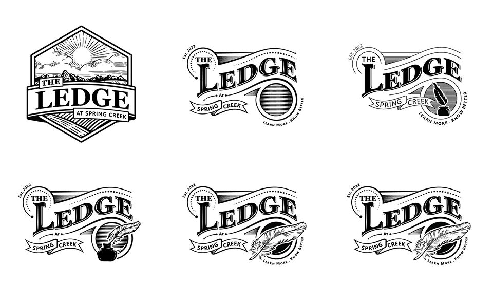
A feather is a tool for writing and a miracle of engineering. Alone, it is delicate; together, feathers grant the power of flight. That became the central metaphor for Spring Creek: individuals coming together to help the community take flight. The curves and tension of the feather were refined until it felt intentional and balanced.
5. Applying the Finish: Color Exploration
Color should never be used to hide a weak design. The mark was perfected in black and white first, to make sure it would work on everything from heavy-duty signage to a simple tax-deductible receipt.
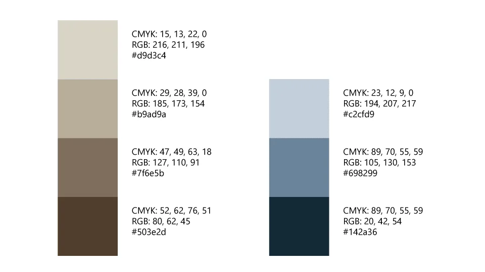
6. The Final Mark: Built for Every Use
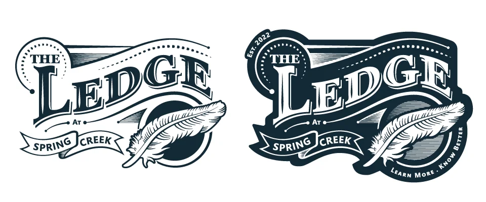
A good tool must be versatile. Because the primary mark leans into a detailed vintage style with banners and flourishes, a simplified version was built alongside it.
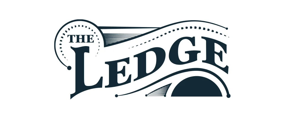
In the logo design process, functionality is king. This secondary mark ensures that whether The Ledge is screen-printing t-shirts or engraving a small wooden plaque, the brand remains clear, legible, and proud.
Why This Process Matters
Design is simply structured problem-solving. Showing the process is a way of demonstrating that a brand isn’t the result of guesswork. It’s the result of craftsmanship. If you’re building something meant to last, the foundation matters most.
Interested in building your brand? See the full site build in the Ledge case study, browse more marks on the Logo & Brand Design page, or fill out a project brief to start building something together.