Conceptual Project
Some projects stay with you. This one is thirteen years old, it never went to market, and I still think about it.
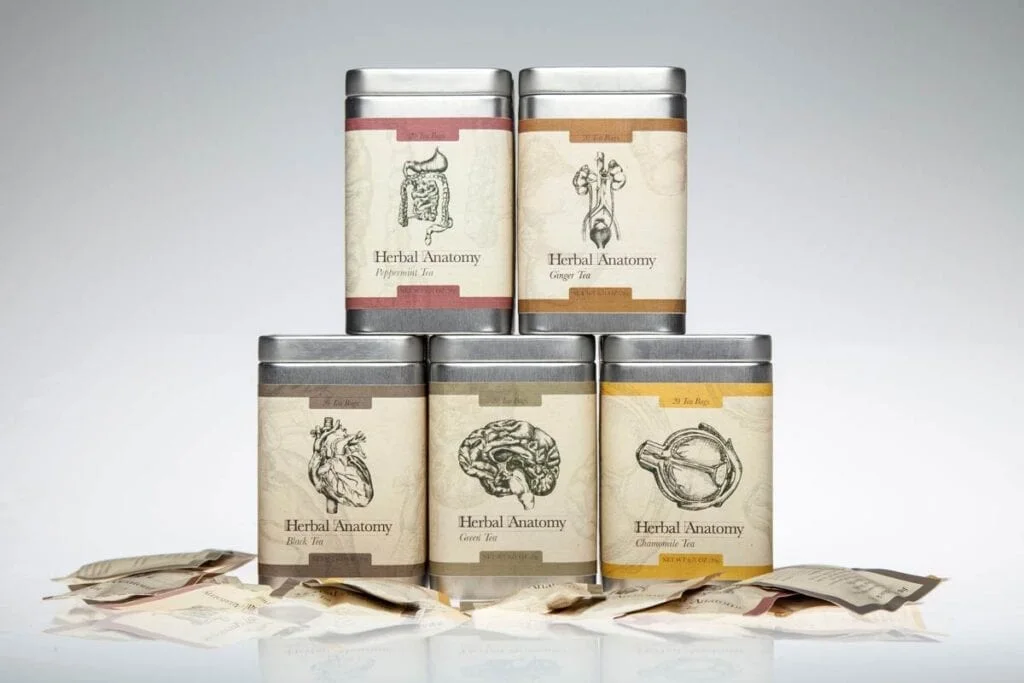
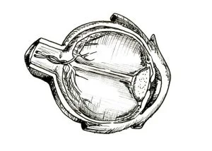
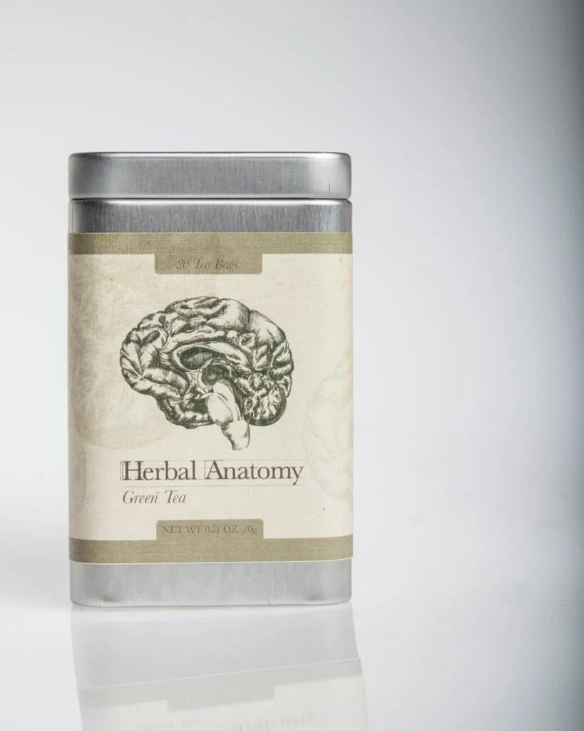
The premise was simple enough to explain in a sentence: a line of teas where every box tells you what it is for, not with a claim on the back, but with a drawing on the front. Peppermint for the gut. Ginger for the kidneys. Black tea for the heart. Green for the mind. Chamomile for tired eyes. Each tin carries an anatomical study of the part of you it looks after.
Why anatomy
Most wellness packaging asks you to take its word for it. Soft colors, a leaf, a promise. It all blurs together on the shelf, and none of it tells you anything.
Anatomical illustration does the opposite. It is honest to the point of being a little confrontational. These drawings come out of a tradition where the whole point was to look closely at something most people would rather not look at, and to render it with enough care that it becomes beautiful anyway. That felt like the right register for a product you put in your body.
It also solved the shelf problem. You do not need to read the label to know which tin is which. You recognize a heart from across the room.
The audience was herbal-medicine-minded from the start: people who already think about what a plant does for a specific part of the body, not a general wellness crowd looking for a nice tin.
The mark
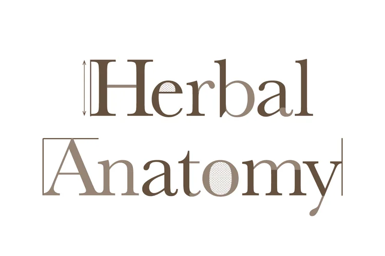
The logotype had to sit between two worlds: clinical enough to carry the anatomy, warm enough to belong on something you drink. The reference lines running down the sides come straight out of old medical plates, where every figure was measured and annotated. The halftone dots caught in the letterforms are a print reference, a reminder that these drawings were always meant to be reproduced and passed around.
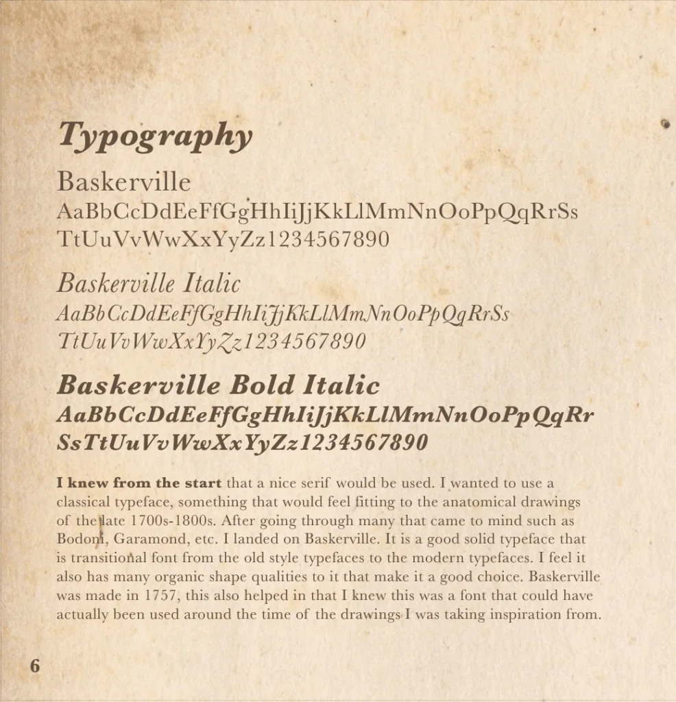
The type is Baskerville. It is a transitional serif, sitting right at the hinge between old-style and modern type, which meant it could have plausibly appeared on a real plate from the 1700s or 1800s without straining the reference. That mattered more than picking something trendier. The whole idea only works if it reads as something dug up, not designed.
The drawings
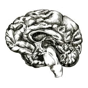
Every organ was drawn by hand in ink. No tracing, no filters. The texture in these is thousands of individual strokes, and that mattered: the whole concept falls apart if the illustrations feel manufactured.
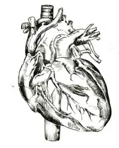
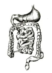
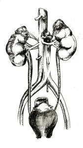
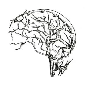
Some organs took more than one pass. The brain got a second study of just the vessels, drawn separately so the structure underneath could be understood before the surface went on top.
Labels & packaging
The label sketches stayed as simple as the concept demanded: one organ, a figure number, a short list of what the tea inside actually does for you. No more decoration than the drawings themselves needed.
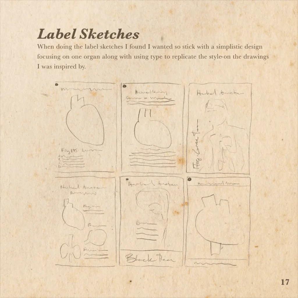
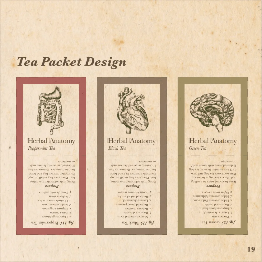
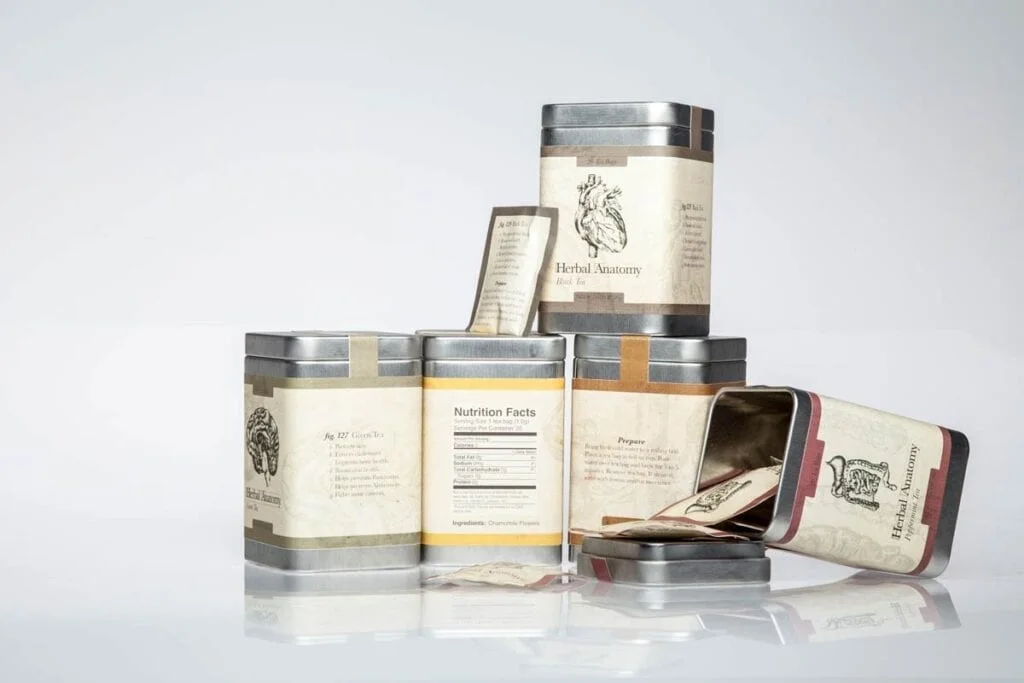
That figure-number habit made it into the finished labels, too. Each tin reads like a page pulled from an actual medical plate, right down to a lettered list of what it treats.
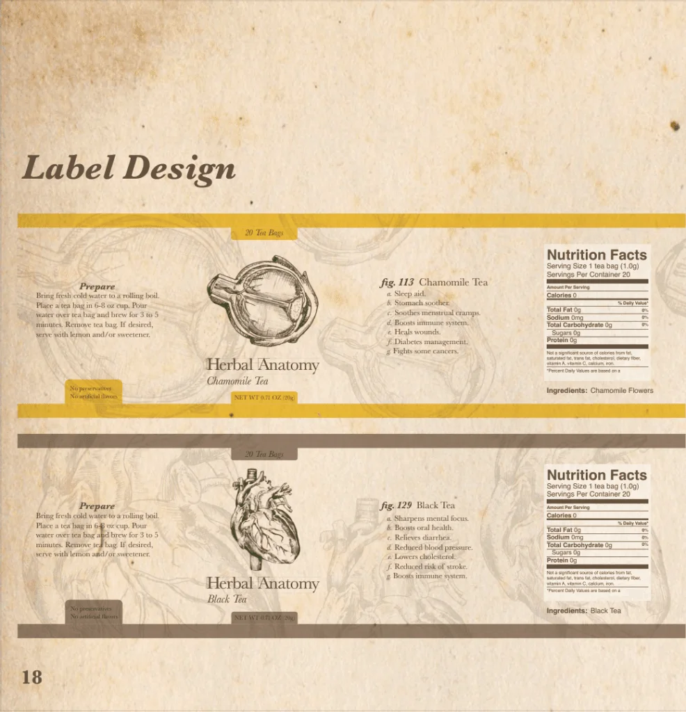
The individual tea packets carry the same idea in miniature. Each one folds closed around its own organ study, so the story is still legible even after the tin lid comes off.
On the shelf
Aged paper, a color band per variety, and the drawing given room to breathe. The tin does the rest: cool metal, a lid with weight to it, something you keep on the counter instead of hiding in a cupboard.
Looking back
There is plenty I would do differently if I picked this up today, but it is still one of the pieces I am happiest to put in front of people.
See the finished pieces alongside the rest of the packaging work on the Packaging & Print page, or read about how brand and packaging projects run at Pixel Chisel. If you have something that needs this kind of attention, start here.