
Brand Kit / Case Study
iKappaDuck
A brotherhood of waterfowlers, and the gear that comes with it.
iKappaDuck makes things for people who are up before dawn in cold water. Hand-turned duck and goose calls, call holders built from driftwood and antler, and decor that brings a little of the marsh into the house. The work is genuinely handmade, and the brand had to earn that.
So nothing here is slick. Every piece leans on wood grain, worn edges, and type that looks like it was stamped rather than set. The goal was for a business card to feel like it belonged in a jacket pocket that had been rained on.
The mark
The mark had to survive being embroidered on a cap, laser-etched into a call holder, and printed two inches wide on a card. That ruled out detail. What is left is a single silhouette that doubles as the letter it starts with, and reads clean whether it is stitched, burned, or printed.
Signage
The banner does one job: say who this is from thirty feet away. Mark, name, and the line that tells you what you are walking up to: Brotherhood of Waterfowlers. Everything else waits until someone is standing at the table.
In the hand
The card is where the brand voice actually shows up. That block of copy is not filler. It is the plainest statement of who the company is, and it does more work than a list of products ever would.
The products, sold in three cards
These ran on the website as the entry point into each product line. Square, image-led, and written so a customer knows in one glance whether it is for them.
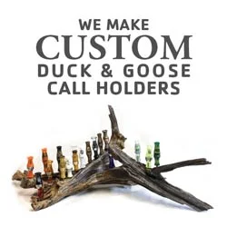
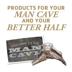
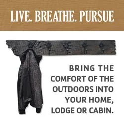
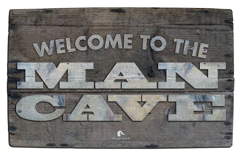
This one sells itself, which is the point. It is a product and an advertisement at the same time. It hangs in the room it was made for, with the mark quietly at the bottom.
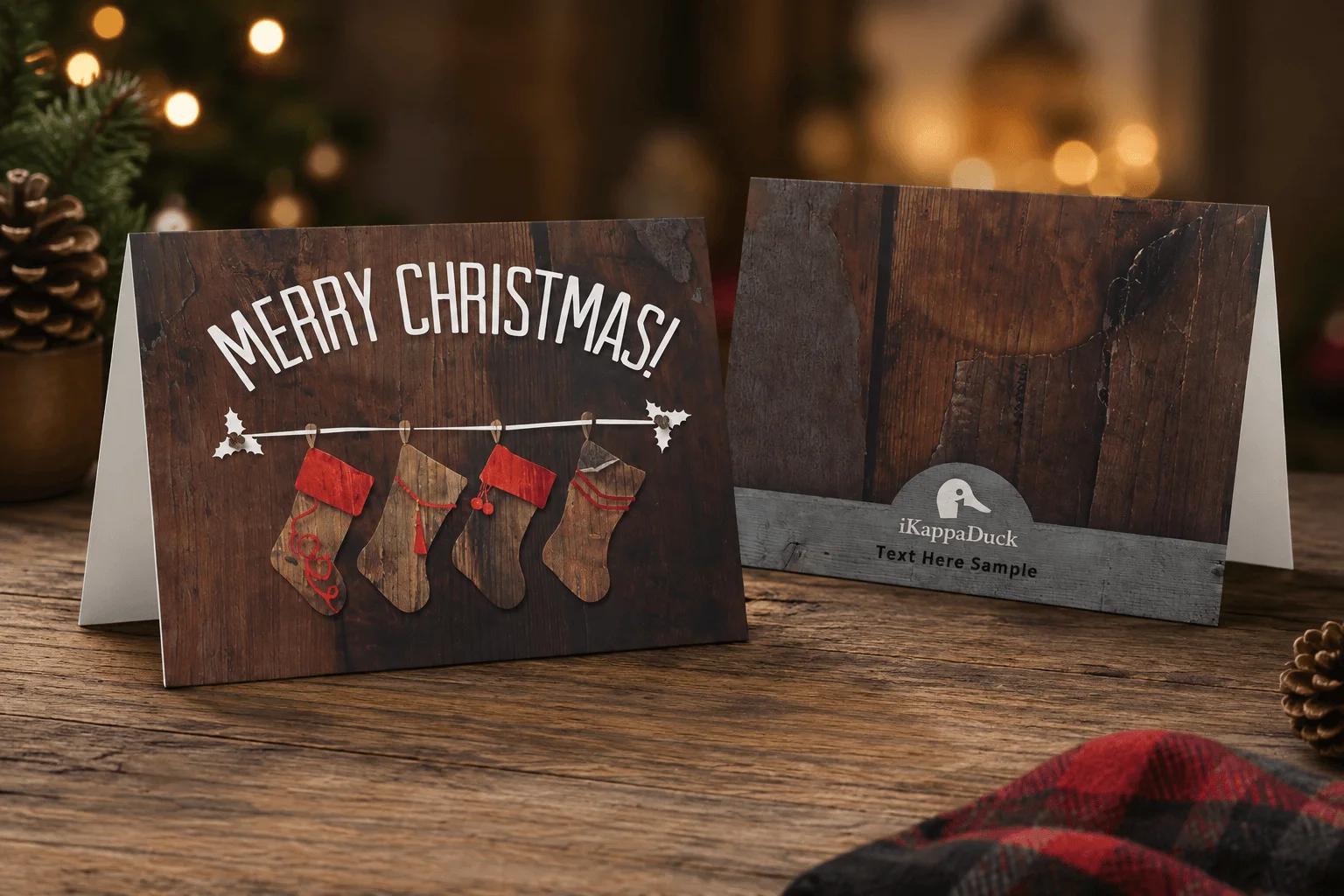
Holiday card
The brand carries past the everyday pieces. A seasonal card for the mailing list, same wood-and-mark language, dressed for December.
What held it together
One material language across everything. Wood behind almost every layout, warm neutrals, and a serif with enough weight to feel stamped. When a brand is built on things people hold, the printed pieces have to feel like they came from the same workshop as the products.
Want a Full Brand Kit Like This?
Mark, guidelines, signage, cards, and print, all working from one material language. See Branding & Pricing >